Hey all,
So many of you may be familiar with the web-comic XKCD (http://xkcd.com/). This is a comedic comic oriented towards a geeky or nerdy audience, with a myriad of science, computing and popular culture related jokes, in addition to more main-stream jokes. While most of the time the comic follows a typical panel-by-panel structure, on occasion the author has been known to draw comedic visualizations as well (he is well known for loving to make graphs and charts). Many of these visualizations have gained popularity throughout the internet both for their accuracy and the creative ways in which they communicate information.
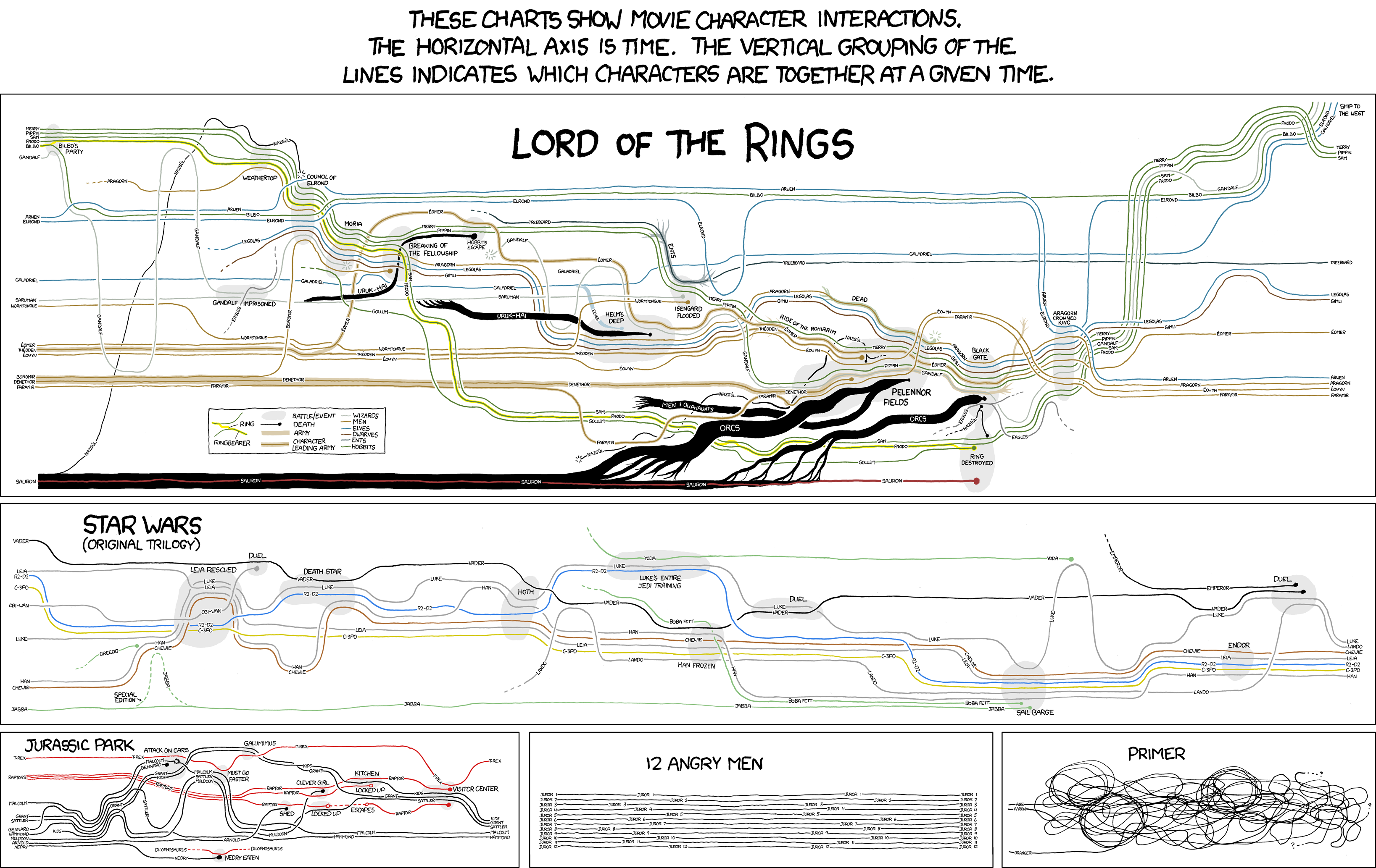
To that effect, I'd like to draw attention to a series of the author's more well known visualizations, the Narrative Chart:

A link to a blown-up version: http://xkcd.com/657/large/
These are very effective visualizations at communicating the physical proximity of various characters in these stories (the first three at least. The last two are mostly there as a punchline and aren't necessarily accurate). This is especially impressive in the Lord of the Rings graph, as that information is very dense and convoluted, and I will use it as my primary example from this series. Notice the use of a legend here, where different colors also communicate the race of each character, as well as whether they are in a battle at that point or not, what armies are where and who is leading them, and also who is currently carrying the One Ring. That, combined with labels were necessary, allows for the plot to be briefly scanned, and in a story where the narrative switches rapidly between different people who are doing things simultaneously, this can actually be a useful guide to the story.
The most intriguing aspect of these visualizations perhaps is that they are intended, not only to communicate this information accurately, but to be humorous while doing so. To that end, big black dots of finality exist where characters die and dotted lines represent points where a character's location is unknown, which can be funny (especially with the eagles in the Lord of the Rings graph) to a viewer already familiar with the information.
I should also here mention the parallel between the visualization of Napoleon's March we have been seeing in class and the visualizations of the armies of Orcs and Uruk-hai marching. In this case, it is not direction but location over time that is communicated, as well as the idea of the armies being mustered together from different locations and joining up with the main group, which isn't present in that image. That said, this bears some similarity as the width of the line representing the army is used to denote how large it is and is shown to grow and shrink over time. It begs the question of whether the author was familiar with that chart, or whether he came up with this on his own.
The biggest flaw in the graph is that while it is communicated well, and the use of lines to denote location have the effect of creating continuity both metaphorically and of the eye, it cam be difficult to keep track of which line is whose, especially for characters who are tracked from the beginning of the graph and are all of the same race, such as the main hobbit characters. It is far easier to trace one character through the plot than to trace a group of them. Some memory of the plot makes this easier to follow, but for an unfamiliar viewer this can be a bit confusing. This is easier on the other charts (the Star Wars and Jurassic park charts, not the joke charts), which tend to have less characters who also group and disband less often.
Anyways, just an interesting visualization I though you all might appreciate ;)
-Jesse Danielson
I saw that "comic" before too! While I am not entirely familiar with the various plots in that comic, it does contain an amazing amount of detail. Maybe perhaps too much detail. This needs to be like wall size for you to really understand, because the lines get confusing as you mentioned.
ReplyDeleteXKCD ftw
ReplyDeletehaha this is pretty cool! and made doubly cooler being from xkcd! :D
ReplyDelete