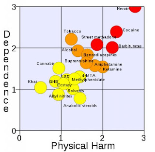
Hey guys, the graph above is a pretty interesting visualization. All the drugs' names are written on the circle, along with the color. We associate red with danger, while yellow is just a precaution. The further up-right the drug is on the chart, the more dangerous it is. I'm not surprised that heroin is the worst, but I am a bit surprised that alcohol and tobacco are ranked so high (I know they're bad, but not that bad). I think this is a very interesting visualization, and an easy to read one at that, too.
No comments:
Post a Comment