Hey guys. I know class is over, but I just wanted to post one more thing because I thought it was cool.
/Film posted a infographic by Sony showing every 3d move ever made and the type of tech the 3d is being portrayed.
Link here
Thursday, June 16, 2011
Wednesday, June 15, 2011
Global Climate and Gravity

http://www.youtube.com/watch?v=Y1E655e0lXw&feature=player_embedded
Internet users divided by region, 2008

A fairly easy to see pie chart of distribution of internet users by region. Though it is slightly dated, I was fond of how the color combination made it jump out and the relative ease in which the statistics seem to be represented. I don't really like how the individual pieces are not labeled though, it does make it minorly annoying to have to keep looking back and forth between the key/legend and the pie chart itself.
Tuesday, June 14, 2011
Keyboard Typing

This was a very interesting picture that I found also on GraphJam. It is a physical visualization. Professor Olson showed us some of these in class, such as the physical visualization wherein a ball appeared to roll up a hill because of the angle at which the camera was situated. I actually thoroughly enjoyed this graphic. It shows the data which it wishes to represent: the frequency with which letters on a keyboard are pressed. It is very simple so the viewer is induced to think about the substance of the data. The data is not distorted. It follows Tufte's Principles. Cool graphic.
Fast Food Nation
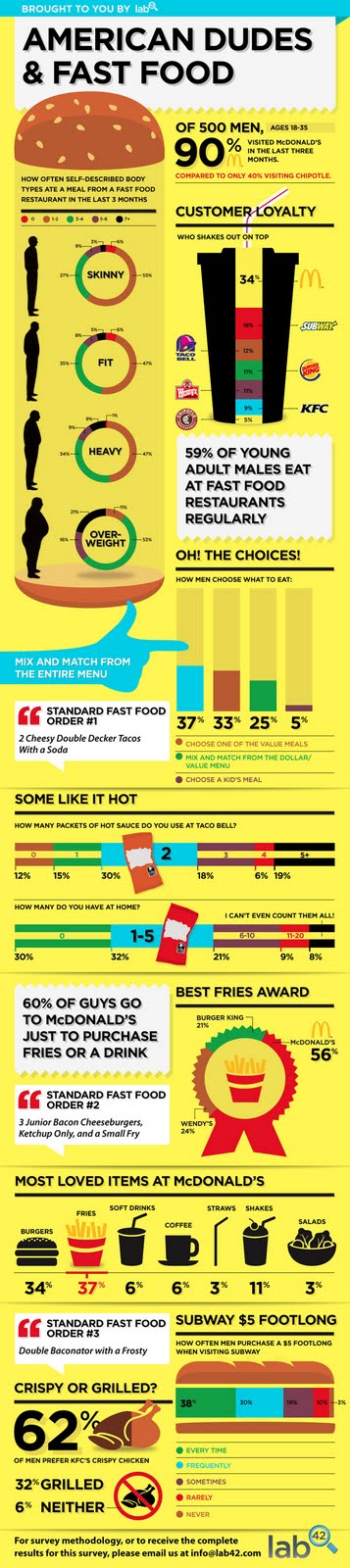
I found this on GraphJam.com It's a funny website that posts pop culture in graphic form. Which works well for this class. I chose this graph because it is still funny, but also informative, simplistic, true and yet visually appealing. While I still do find some faults with this graph as to its purpose - it seems to get a little sidetracked and does not appear to have one main purpose - it still is a good visualization in my opinion. It shows the data very clearly. It presents many numbers in a small space, and in doing so makes the large data sets coherent.
Good Code XKCD Graphic

I am find humorous visualizations the most fun of all. So those are the ones I find. Ergo, those are the ones I post on here. Instead of The Oatmeal. This time, this one comes from XKCD. I'm sure many people from class read XKCD and therefore many may have already seen this. This is actually a very simple visualization. But that follows Tufte's Principles. There's no need to make anything massively overblown when simplicity will suffice. And, it's about coding, which rings true for many in this class. This is a true and funny graph.
Angry Birds Graphic

While this may not be extremely educational, I consider very useful and true. Angry birds has 40 million active monthly users according to Rovio. I'm sure that many members of our class are either included in that number or have at least used the game once or twice in passing. This graphic is like a scale. It describes each type of bird succinctly and rather funnily. It has an image of each bird so the viewer can also visually see and remember and recall what they are looking at. Although this visualization may not serve a grandiose higher purpose, it accomplished its goal. YAY ANGRY BIRDS!
Sunday, June 12, 2011
TED talk: Why I taped my son's childhood
http://www.cnn.com/2011/OPINION/03/13/roy.tapes.childhood/index.html?iref=NS1
A really cool talk by Deb Roy. He recorded his son's first few years and used the data to analyze how he learned to talk. The graphs and visualizations that he uses to show his data is really cool.
Saturday, June 11, 2011
World of Warcraft Global Statistics

These are detailed visualizations on statistical information regarding the popular MMORPG, World of Warcraft. The data visualized here includes statistics on population, income, upkeeping costs by Blizzard, gender population, accomplishments in-game by expansion sets, guilds, items, and many more. By visualizing this data it helps give a clearer perception of the magnitude of time invested in the virtual world and the impact World of Warcraft has in the real world.
Thursday, June 9, 2011
Fluid Dynamics
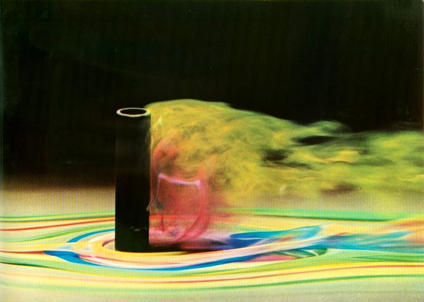
Heres a visualization of fluid dynamics much like a wind tunnel would produce.
It's interesting how air looks, you can see these types of things with smoke as well, but when its colored into a visualization you get a more detailed understanding of the velocities and currents are created.
Comparing incomes
 Hey guys. The above shows the average amount of money a person makes in 40 years of work, depending on his education level. There is definitely a huge jump between a high school diploma and a bachelor's degree, so college is most likely worth it (not surprising for us). However, there doesn't seem to be much difference in terms of income between a bachelor's and a master's degree. Now a doctorate and professional degree, those look nice.
CIA World Factbook Visualizations

This is a visualization that shows semantic relationships for each country, including neighboring countries, languages, water and terrestrial boundaries, and more.
As you can see from the visualization. France is in the center of the bubbles. It seems that all countries have a relationship with France. This visualization is great in sense that it does a great job on showing the relationship of each country.
Kevin Chen
33116245
3D mapping of a human chromosome

This is a 3D mapping of a human chromosome using coherent x-ray diffraction. This technique accurately maps out very small objects that are too thick for electron microscopy. As a result, we as humans are able to perceive the shape of items much too small for traditional perception. It's all part of understanding and visualizing the parts of the universe that are out of our range.
Wednesday, June 8, 2011
Preattentive processing
 This bubble map is an example of visualization which uses color for preattentive processing. When we look at this visualization, we notice the big orange bubble immediately. Such effect has the reason not only that the orange bubble is unique among the blue bubbles, but also the orange color is preattentive stronger at catching attention in comparison to the blue color.
Macbook technical specifications table
This example is really easy to understand, and kind of "obvious." I haven't seen anyone post this, so I decided to do so. Basically this visualization is a simple table listing all the different models of the Macbook Pro over the years and the technical specifications each model (and the upgradeable options). The boxes for each section show where certain technical aspects of the model is shared with other models by its size. It is really to understand, and a visualization in itself, though mostly text.
LINK
LINK
Tuesday, June 7, 2011
Visualization of how I would have felt if we had a final exam in 143...
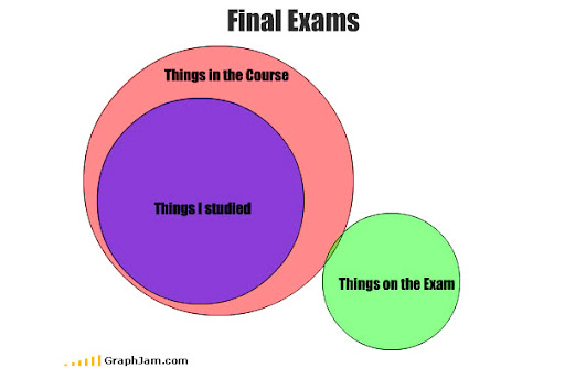
Visualizations can be humorous too :)
Aaron Koblin: Artfully visualizing our humanity
Monday, June 6, 2011
Visualizing Emotions
When I was trying to find a media player, I found this site where it shows visualizations connected to the emotions of a song's lyrics. It was interesting as to how it interpreted different affections similar to a person's facial expressions. These visualizations seems to be a closer step towards computer and human interaction. Like this picture, color and shape can define what a music's lyrics emotion is.

http://visualizingmusic.com/2009/09/11/visualizing-emotion-in-lyrics/
-Alicia Carlin
http://visualizingmusic.com/2009/09/11/visualizing-emotion-in-lyrics/
-Alicia Carlin
Subscribe to:
Comments (Atom)