Hey guys. I know class is over, but I just wanted to post one more thing because I thought it was cool.
/Film posted a infographic by Sony showing every 3d move ever made and the type of tech the 3d is being portrayed.
Link here
Thursday, June 16, 2011
Wednesday, June 15, 2011
Global Climate and Gravity

http://www.youtube.com/watch?v=Y1E655e0lXw&feature=player_embedded
Internet users divided by region, 2008

A fairly easy to see pie chart of distribution of internet users by region. Though it is slightly dated, I was fond of how the color combination made it jump out and the relative ease in which the statistics seem to be represented. I don't really like how the individual pieces are not labeled though, it does make it minorly annoying to have to keep looking back and forth between the key/legend and the pie chart itself.
Tuesday, June 14, 2011
Keyboard Typing

This was a very interesting picture that I found also on GraphJam. It is a physical visualization. Professor Olson showed us some of these in class, such as the physical visualization wherein a ball appeared to roll up a hill because of the angle at which the camera was situated. I actually thoroughly enjoyed this graphic. It shows the data which it wishes to represent: the frequency with which letters on a keyboard are pressed. It is very simple so the viewer is induced to think about the substance of the data. The data is not distorted. It follows Tufte's Principles. Cool graphic.
Fast Food Nation
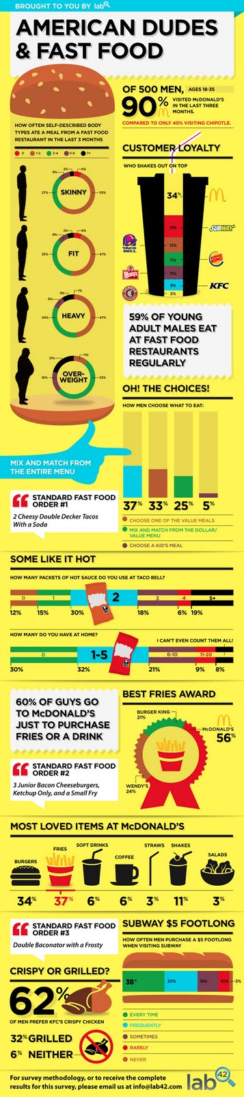
I found this on GraphJam.com It's a funny website that posts pop culture in graphic form. Which works well for this class. I chose this graph because it is still funny, but also informative, simplistic, true and yet visually appealing. While I still do find some faults with this graph as to its purpose - it seems to get a little sidetracked and does not appear to have one main purpose - it still is a good visualization in my opinion. It shows the data very clearly. It presents many numbers in a small space, and in doing so makes the large data sets coherent.
Good Code XKCD Graphic

I am find humorous visualizations the most fun of all. So those are the ones I find. Ergo, those are the ones I post on here. Instead of The Oatmeal. This time, this one comes from XKCD. I'm sure many people from class read XKCD and therefore many may have already seen this. This is actually a very simple visualization. But that follows Tufte's Principles. There's no need to make anything massively overblown when simplicity will suffice. And, it's about coding, which rings true for many in this class. This is a true and funny graph.
Angry Birds Graphic

While this may not be extremely educational, I consider very useful and true. Angry birds has 40 million active monthly users according to Rovio. I'm sure that many members of our class are either included in that number or have at least used the game once or twice in passing. This graphic is like a scale. It describes each type of bird succinctly and rather funnily. It has an image of each bird so the viewer can also visually see and remember and recall what they are looking at. Although this visualization may not serve a grandiose higher purpose, it accomplished its goal. YAY ANGRY BIRDS!
Subscribe to:
Comments (Atom)